Introducing Pantone’s ‘Color Of the Year’: Vivid Magenta
Bring Some ‘Vivid Magenta’ Into 2023 with these tips and of course… ARTWORK From Pinot’s Palette!
Viva Magenta is not only balanced between warm and cool, but between historical and futuristic. The shade is a take on carmine red, one of the most expensive and prized natural dyes, derived from cochineal insects. “As virtual worlds become a more prominent part of our daily lives, we look to draw inspiration from nature and what is real,” said Leatrice Eiseman, Executive Director of the Pantone Color Institute. “Rooted in the primordial, PANTONE 18-1750 Viva Magenta reconnects us to original matter. Invoking the forces of nature, it galvanizes our spirit, helping us to build our inner strength.”
What is Viva Magenta?
Pantone’s Color of the Year, Viva Magenta 18-1750, vibrates with vim and vigor. It is a shade rooted in nature descending from the red family and expressive of a new signal of strength. Viva Magenta is brave and fearless, and a pulsating color whose exuberance promotes a joyous and optimistic celebration, writing a new narrative.
This year’s Color of the Year is powerful and empowering. It is a new animated red that revels in pure joy, encouraging experimentation and self-expression without restraint, an electrifying, and a boundaryless shade that is manifesting as a stand-out statement. PANTONE 18-1750 Viva Magenta welcomes anyone and everyone with the same verve for life and rebellious spirit. It is a color that is audacious, full of wit and inclusive of all.
In this age of technology, we look to draw inspiration from nature and what is real. PANTONE 18-1750 Viva Magenta descends from the red family, and is inspired by the red of cochineal, one of the most precious dyes belonging to the natural dye family as well as one of the strongest and brightest the world has known.
"Rooted in the primordial, PANTONE 18-1750 Viva Magenta reconnects us to original matter. Invoking the forces of nature, PANTONE 18-1750 Viva Magenta galvanizes our spirit, helping us to build our inner strength."
-- Leatrice Eiseman; Executive Director, Pantone Color Institute
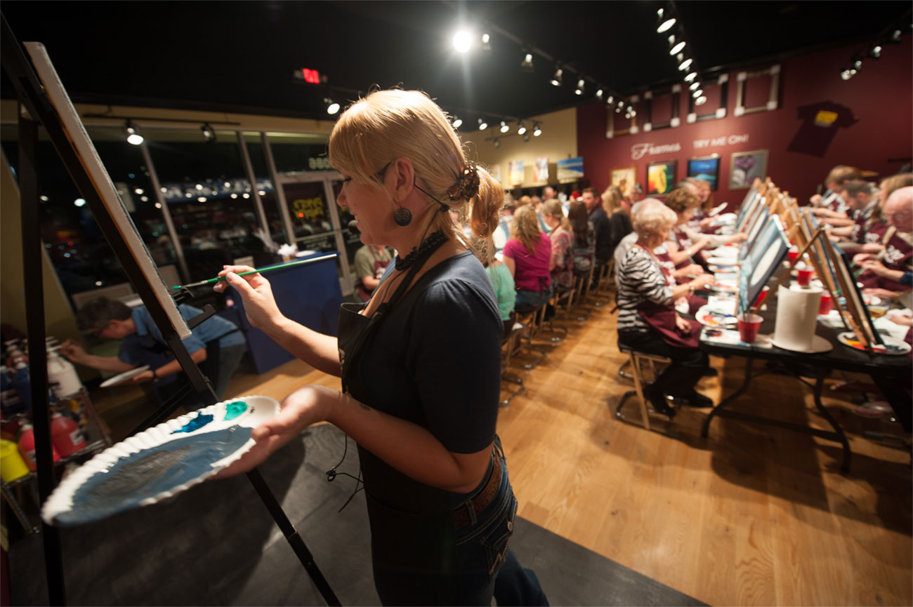
PAINT WITH US:
Join us all month long to celebrate this fabulous color... AND just because our example paintings on the schedule don't have the stunning magenta shade in them, doesn't mean you can't add it to your masterpiece!
Here are some of our favorites for January:
Jan 12 - ‘Morning Poppies’ ((*Photo, Above))
There is nothing more beautiful than a a sunrise! Paint the sky with deep reds and warm yellows, and finish your masterpiece with a luscious field of poppies.
https://www..../event/663452
Jan 19 - ‘Psychedelic Starry Night’
BLACK LIGHT CLASS!
This vibrant take on Van Gogh’s Starry Night is just as fun to paint in the daylight as it is under blacklight. The glowing color palette is easy to customize, and the simple design is very beginner-friendly. Join us and paint your own technicolor masterpiece!
https://www..../event/663427
—> Paint This One From Home: https://www....-starry-night
This Paint At Home painting kits will include everything you need to create the masterpiece, inclduing the pre-recorded, video tutorial that will take you STEP-BY-STEP through the painting sent to your email!
Jan 21 - 'To The Moon And Back’
DATE NIGHT CLASS!
Tell them you love em’ to the moon and back and join us to paint this beautiful couples set!
2 paintings designed and painted to display as 1 large painting. Each person paints 1 canvas of a 2 canvas painting...1 canvas per person....reserve 2 seats. Also can be painted on 1 canvas.
https://www..../event/663429
Want to paint To The Moon And Back Date Night at home on demand? Order supply kit and painting video here-
https://www....k-couples-set
Jan 27 - Vibrant Emotions
Have fun blending and creating the vibrant colors of this painting. Paint outside of the lines, unleash your creative side . This painting is perfect for beginners .
https://www..../event/663455
Jan 31 - Pumed Peacock
Painting this plumed peacock makes for a pleasing party! All alliteration aside, this gorgeous fowl would be a fabulous addition to your home décor.
Tuesday Night Special-$29
https://www..../event/663448
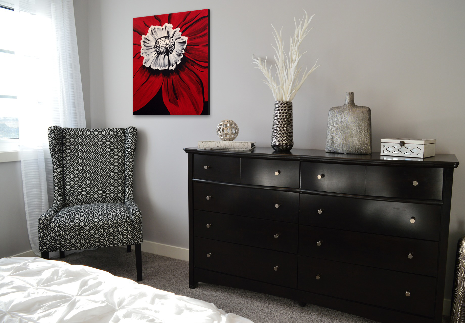
Red has been absent in Pantone’s past decade-plus of selections; you have to go back to 2007 for Chili Pepper, and to 2002 for True Red. The shade, however, is a natural choice for the home space; red is often thought of as a color for kitchens due to its energetic vibe, and it’s frequently one of the first choices for accents and accessories in any room. Viva Magenta’s unique balance of warm and cool tones makes it an easy addition, whether you prefer neutrals, jewel tones, or brights, as depicted in the palettes below:
*** Magenta Pairing Colors With This Shade ***
---> Other Colors In The ‘Magentaverse’
Pantone and creative partner Huge collaborated with ARTECHOUSE to develop an immersive color experience, the Magentaverse, which premieres during Art Basel in Miami. The rooms feature textures and interactions that plunge attendees into an array of visual, auditory, and tactile experiences related to Viva Magenta.
***Gray Sand; Gray Lilac; Pale Khaki; Fields Of Rye; Agate Gray; Plein Air
---> Elegant, Full-Bodied, & Substantive Shades, Like Magenta... By Pantone:
Biscay Bay; Rose Taupe; Gloxinia; Fir Green; Silver Pine