Color Trends of the Moment: What We’re Seeing in Fashion, Home Decor, and Art
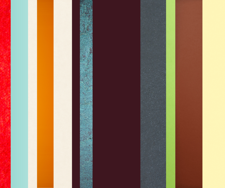
Our sources point to this shift across several trend leaders, with Pantone naming Cloud Dancer its 2026 Color of the Year, Etsy choosing Patina Blue, and Pinterest highlighting shades like Cool Blue, Jade, Plum Noir, Wasabi, and Persimmon. Paint brands are leaning warmer and moodier too, with Sherwin-Williams choosing Universal Khaki, Benjamin Moore choosing Silhouette, and Behr choosing Hidden Gem.
In fashion, butter yellow, tomato red, lime, purple, and other bright statement colors are also continuing to stand out, creating a palette that feels stylish, personal, and full of possibility.
*** Soft Whites & Creamy Neutrals ***
A soft neutral background gives every other color room to shine.
One of the biggest color directions right now is a return to soft whites and creamy neutrals. These are not cold, stark whites. They feel warmer, calmer, and more natural. Think cloud white, warm ivory, soft linen, and creamy beige.
In fashion, these colors show up in breezy shirts, linen sets, relaxed dresses, and polished basics. In home decor, they create rooms that feel peaceful, open, and easy to live in. They also work beautifully as a base for more expressive colors, which is why they are so popular in both design and art.
*** Warm Browns & Grounded Earth Tones ***
These earthy tones are perfect for anyone who wants color that feels timeless, cozy, and elegant.
Chocolate brown, espresso, khaki, clay, and tan are having a major moment. These colors feel grounded and sophisticated without being boring. They bring warmth into a room and richness into an outfit.
In home decor, brown has moved far beyond the heavy, dated look people may remember from years ago. Today’s browns feel more intentional. They pair beautifully with natural materials like wood, linen, brass, stone, and woven textures. In fashion, rich brown can feel just as elevated as black, but a little softer and warmer.
*** Patina Blue & Soft Blue-Greens ***
Blue is always a classic, but the blues trending right now feel softer and more lived-in. Patina blue, dusty teal, smoky jade, and blue-green shades are especially popular because they feel calm without feeling plain.
These colors work beautifully in both fashion and interiors because they can shift depending on how they are styled. With white and tan, they feel coastal and airy. With brass, copper, or deep brown, they feel vintage and sophisticated. With brighter colors, they can feel creative and fresh.
Blue-green shades also translate beautifully into artwork. They are perfect for skies, water, florals, abstract backgrounds, and peaceful landscapes.
*** Butter Yellow & Soft Sunshine Shades ***
The types of color that instantly make something feel happier.
Butter yellow is still going strong, and it is easy to see why. It is cheerful without being too loud. It feels softer than bright yellow, but still brings warmth and optimism.
In fashion, butter yellow works almost like a neutral. It pairs well with white, denim, brown, blue, and even red. In home decor, it can bring a gentle glow to pillows, art, florals, table settings, and accent pieces.
*** Deep Plum, Charcoal, & Moody Accents ***
These colors make the softer shades feel more interesting.
On the richer side of the trend palette, deep plum, charcoal, espresso, and smoky jewel tones are making spaces and outfits feel more dramatic. These colors are especially popular as accents because they add depth and contrast.
A soft room can feel more finished with a charcoal frame, a deep plum pillow, or a dark brown piece of furniture. A simple outfit can feel more styled with one rich, moody color. In paintings, these deeper shades help create shadows, contrast, and drama.
*** Bright Pops Of Color ***
--> Persimmon, Wasabi, Tomato Red, & Lime
Alongside all the calming colors, there is also a playful side to current color trends. Bright, unexpected shades like persimmon, tomato red, wasabi green, lime, and bold pink are showing up in fashion, accessories, and home accents.
These colors are not always used everywhere at once. Sometimes just a small pop is enough. A bright handbag, a bold vase, colorful artwork, or one playful detail in a room can make the whole space feel more current.
That same idea works in painting. A little pop of color can completely change the energy of a piece.
*** Bringing the Colors of the Moment to Pinot’s Palette ***
One of the best things about painting is that it lets you experience color in a hands-on way, not just by seeing trends in a magazine or store window, but by mixing, layering, and brushing them onto the canvas yourself.
At Pinot’s Palette, upcoming artwork is a fun and relaxed way to explore the colors of the moment, from soft neutrals and calming blues to earthy greens, buttery yellows, and bold pops of red, orange, pink, and lime.
A painting class lets you bring those color trends into your home in a personal, handmade, and meaningful way without repainting a room or buying all new decor.