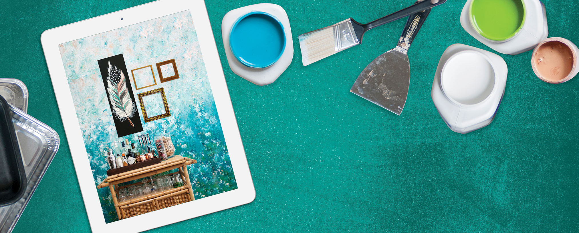
ART WALL
This is how to do a faux finished wall – easy process, gorgeous results! Nervous to try it? Practice on a stretched canvas to perfect your technique and make sure the colors work.
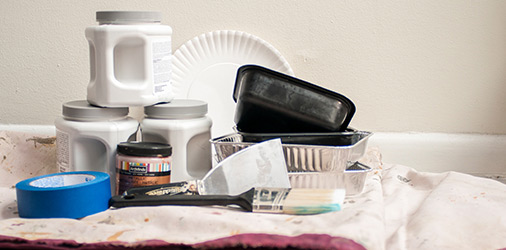
DIY FAUX FINISH WALL SUPPLIES LIST
Here are the supplies we used:
• Blank accent wall
• Drop cloths
• Painter’s tape
• 1 32 oz. can metallic acrylic paint (we used copper)
• 2 quart sized satin finish latex wall paints in analogous (similar) colors. We chose turquoise blue and emerald green (Sherwin Williams SW-6720 and SW-6769)
• 1 quart satin finish latex wall paint in white (we used SW-Extra White)
• 1 small can of thickening gel additive (Liquitex® Liquithick® thickening gel, artist acrylic, 237 mL)
• 1 package scalloped paper plates
• 1 4” chip brush
• 3 medium sized foil or plastic pans
• Ladder
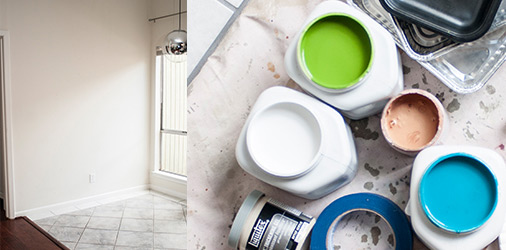
1. WALL AND COLOR SELECTION
The perfect wall for this project will be on the small side and near an entryway with plenty of natural light. Metallic tones reflect nicely in the sunlight.
Choose two analogous colors (close to each other on the color wheel) that coordinate with your home décor. Try blue and green, orange and golden yellow, or violet and indigo shades. For the metallic paint, select a tone that coordinates with your two colors (we used copper).
Pro Tip: For color ideas, check out the Pantone colors of the year. We selected an emerald green like the 2017 color of the year.
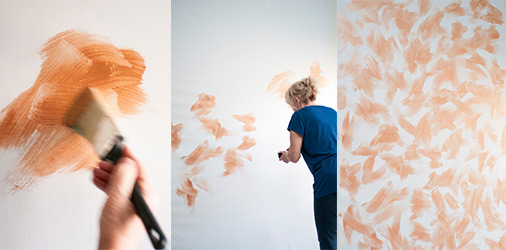
2. METALLIC UNDERTONES
Clear artwork or adhesives from your wall, tape off the boundaries of the wall with painter’s tape and cover the floor with a drop cloth.
Using your chip brush and copper paint, paint clusters of brush strokes sporadically in multiple directions, all over the wall. You don’t need to saturate the wall, but create texture by leaving some areas white.
Pro Tip: Work quickly and energetically, with expressive motions. This will give your brush strokes a feather-like shape.
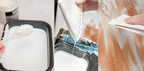
3. WHITE FAUX FINISH TEXTURE
Pour the white paint into one of the pans. Add 2-3 spoonsful of acrylic thickener and stir until thickened. Fold a paper plate into quarters. This is your painting tool! Dip one edge of the folded plate into the paint and use a scraping motion in all directions to apply the paint. Start at the top and work your way down.
The paint should appear spotty, thick, textured and uneven. It should be heaviest at the top and become sparse as you approach the halfway point. The white paint should stop altogether about 2/3 of the way down the wall.
Pro Tip: Replace the paper plate with a new one periodically when it becomes saturated or loses its shape.
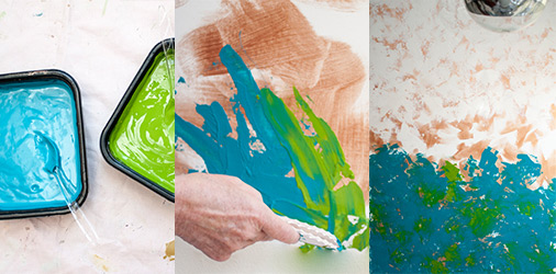
4. COLORED TEXTURES
Pour each color into its own plastic pan and stir thickener into each. Repeat the paper-plate scraping process from the bottom of the wall, working upward. For high-contrast texture, you can alternate between the two colors, using one plate for each. For a more blended texture, use one plate and dip into both colors at the same time. Continue moving up the wall until you’ve overlapped the white section by at least 1-2 feet.
Pro Tip: Resist the urge to organize the textured marks or try to line things up perfectly. Embrace the differences in each mark you make.
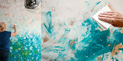
5. BLEND
Tap the center of the wall to see how wet the paint is. If the white and colors are both still wet, prepare a fresh paper plate and use the same scraping motion to blend the colors without adding new paint.
If the white or colors have dried in the center, add more paint. Dip a fresh plate into all three colors and scrape across the center of the wall where the colors meet. The blended area should be at least 2-3 feet and should transition smoothly from light to dark. Be careful not to over-blend. The wall should remain textured and uneven.
Pro Tip: Do the “artist tango” and step back periodically to look at the wall from a distance. You’ll be able to spot areas that need more attention, as well as areas that look great and should be left alone.
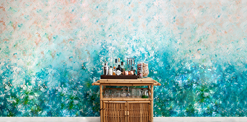
STYLING TIPS
Faux walls are fun and easy to decorate because they make a statement all by themselves. Go easy on the artwork to keep your wall from getting damaged or looking too busy.
Try contrasting the ombré color fade with one or two dark, minimalist pieces of art. Thin, dark frames with ample white matting are a perfect, soft balance for this textured wall. You can also add a mid-century twist with a bamboo bar cart or sputnik chandelier.